

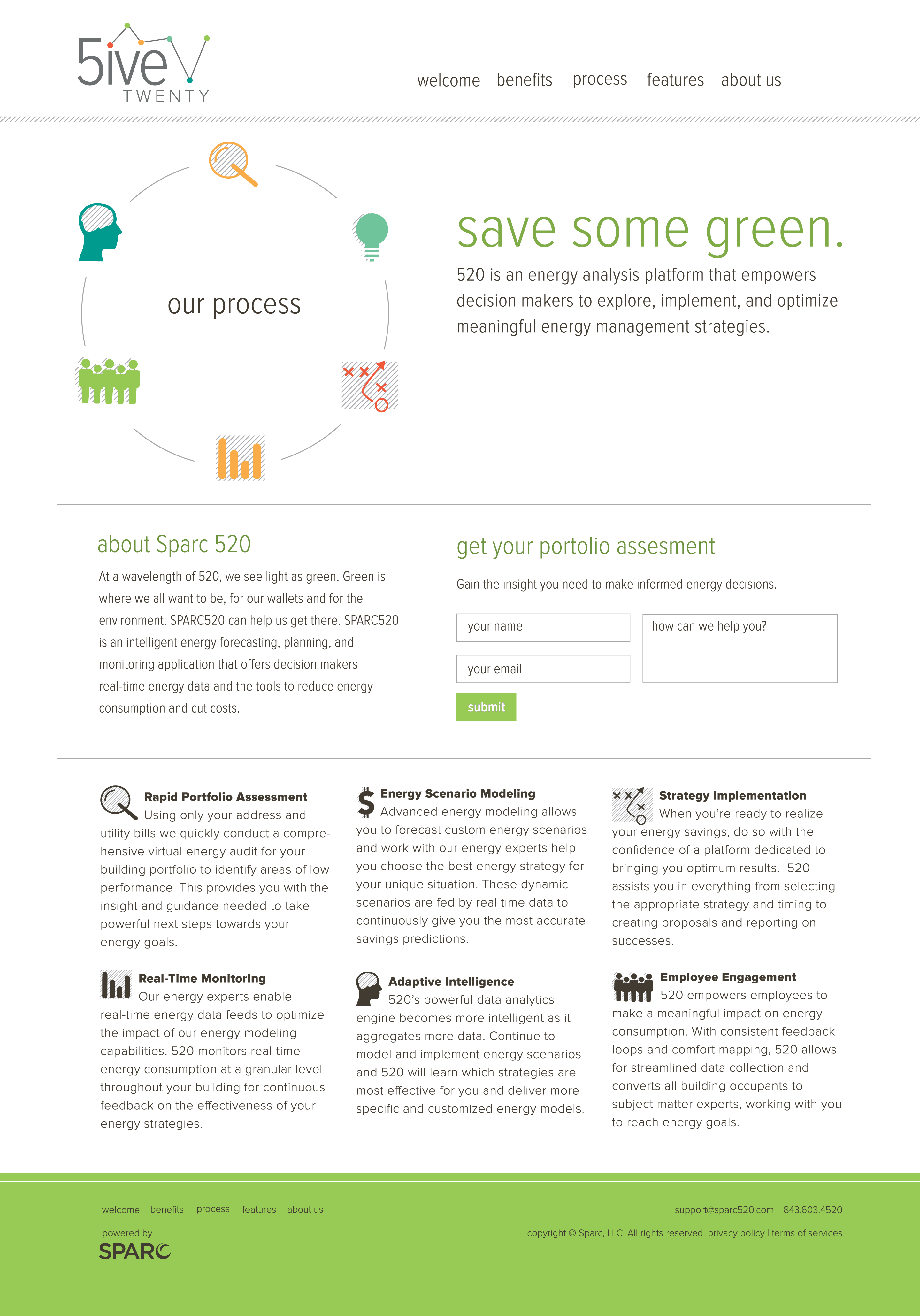
Designing the custom iconography set gave me some welcomed illustration opportunities and serve as a nice GraySubtle to surrounding information.
Out of the endless design needs, the biggest task was creating the app's interface. The interface needed to clearly communicate specific data points to customers who could then strategize opportunities to save. I used a bright color palette for the various infographics which contrasted nicely with the neutral, cool gray designated for text display.